Giving our kitchen a facelift has been one of the best things we’ve done to our home. Updating the cabinet color and backsplash breathed some life into the kitchen and was so much easier (and kept me saner) than a full on renovation.
When we moved to the suburbs of St. Louis 2.5 years ago, I had one weekend to decide on a home. My husband traveled to the area regularly for work so he had narrowed down our house hunting to 4 different homes. One weekend, the kids and I traveled there to meet him and to tour the narrowed down selection. He had done a great job and there were two homes in the same subdivision we debated between. Ultimately, we decided on our Tudor style home as it felt better suited to the needs of our family.
The Before
I knew that there were areas of the home I loved and others I wasn’t a total fan of, but which we could update. We officially moved in a few months later.
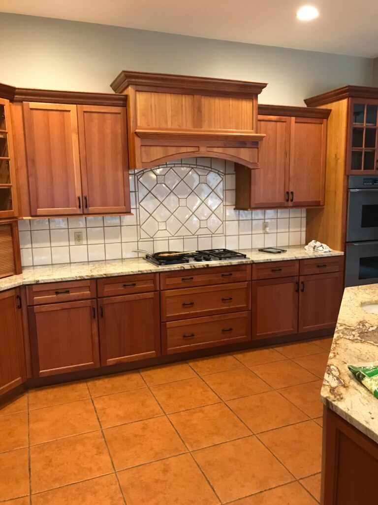
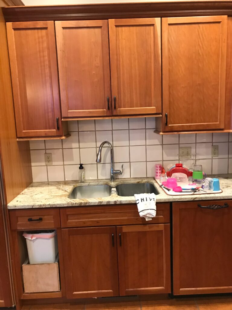
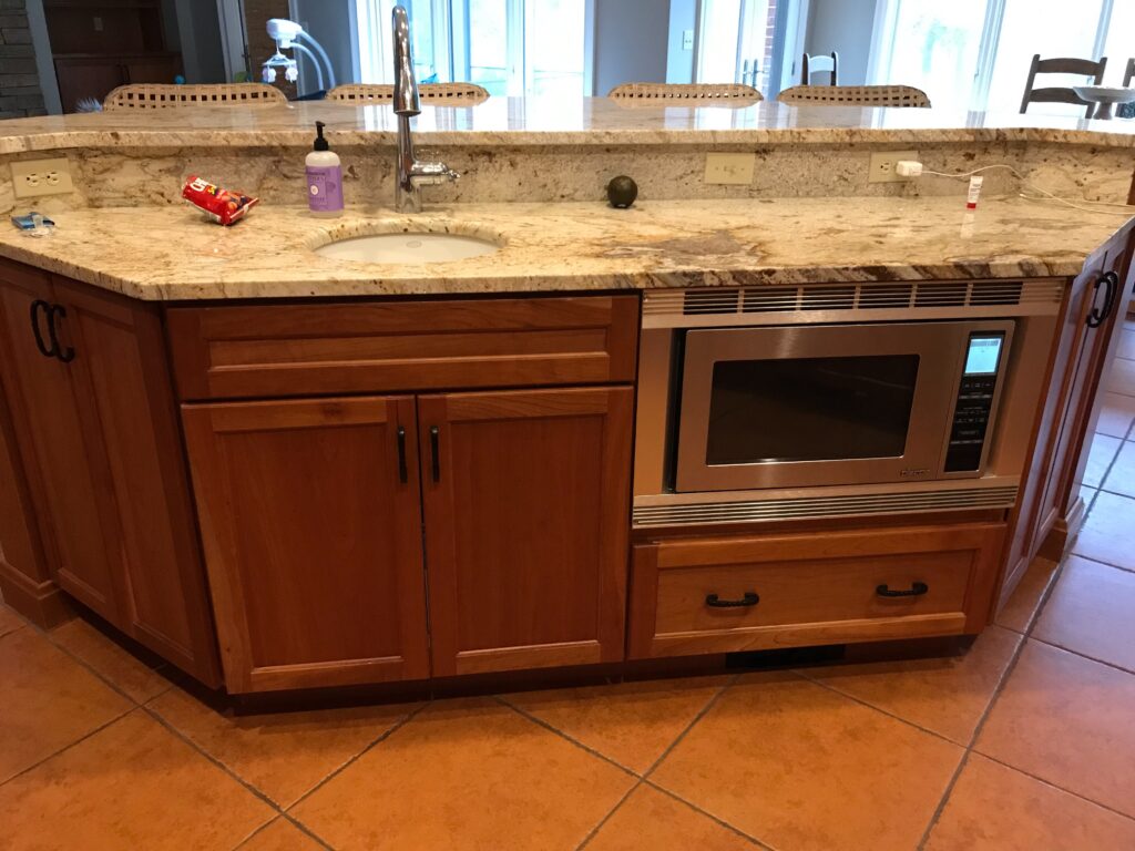
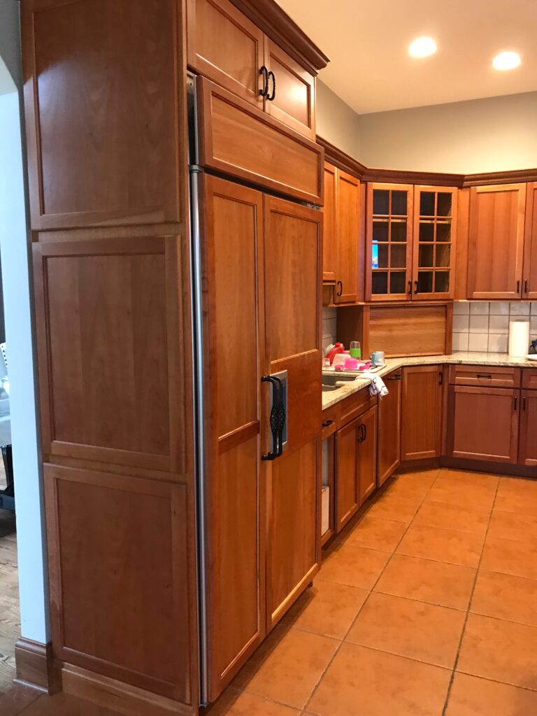
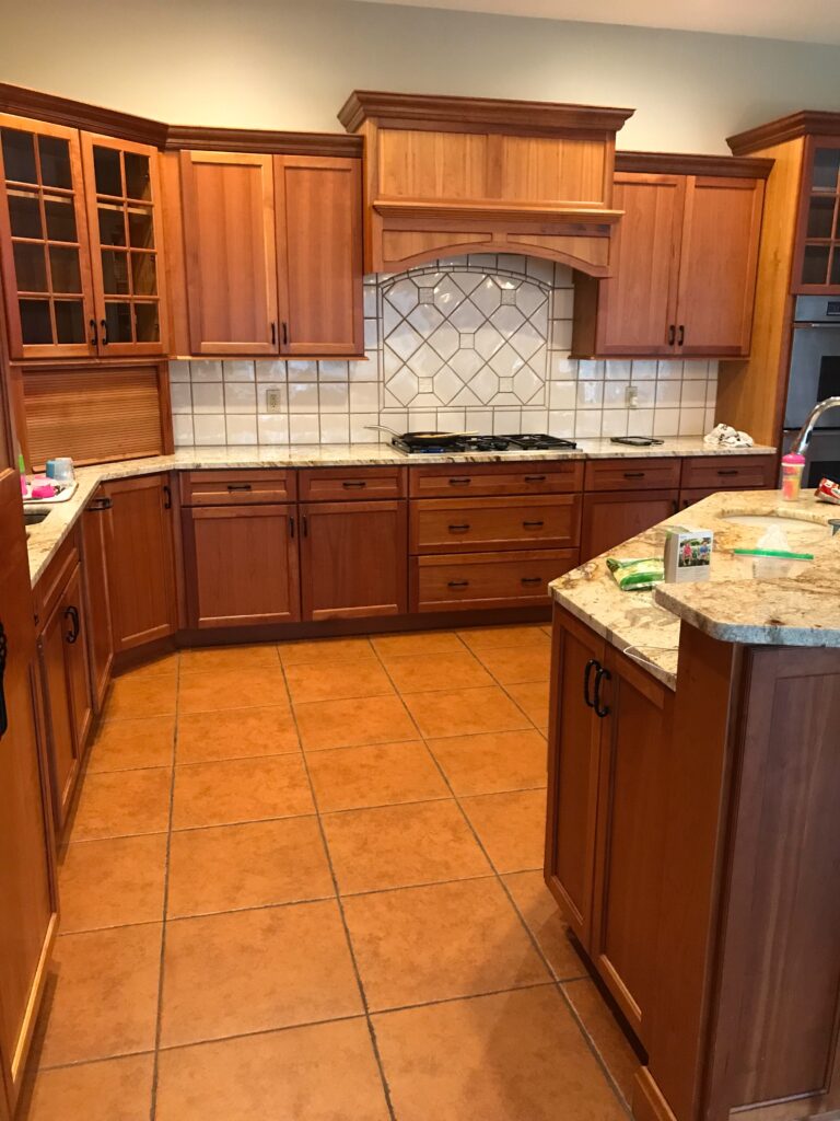
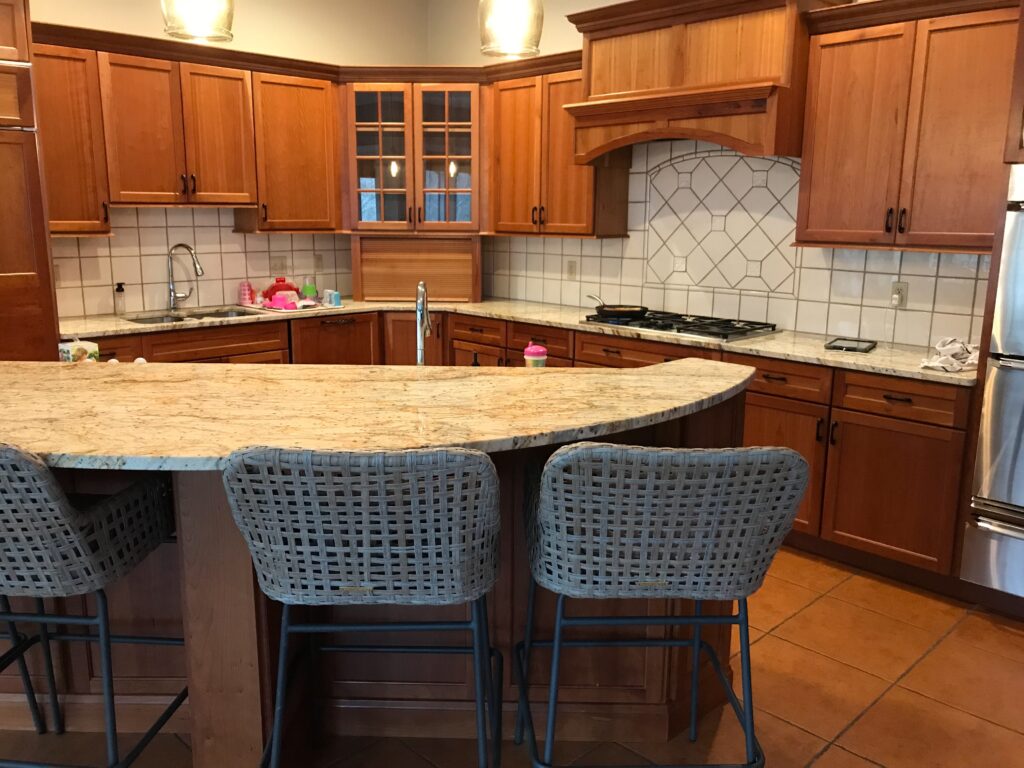
The kitchen was in the number one spot for “things I want to change”. Functionally, there wasn’t anything wrong with it. And, though I wouldn’t have picked the cabinets myself, I actually kind of liked them. The problem was that the rustic cabinets and the Spanish tile floors were almost the exact same color giving the illusion of a VERY brown kitchen. To top that, the backsplash was outdated and super “tired” looking.
After living at the house for awhile, my husband and I started discussing the kitchen. We disagreed on whether or not a full renovation would take place. He wanted to gut the entire kitchen and I didn’t. I was tired. I didn’t want to make the one million decisions that go along with a full blown renovation or the mess. So, he finally saw the light and I started picking out paint colors.
The Solution
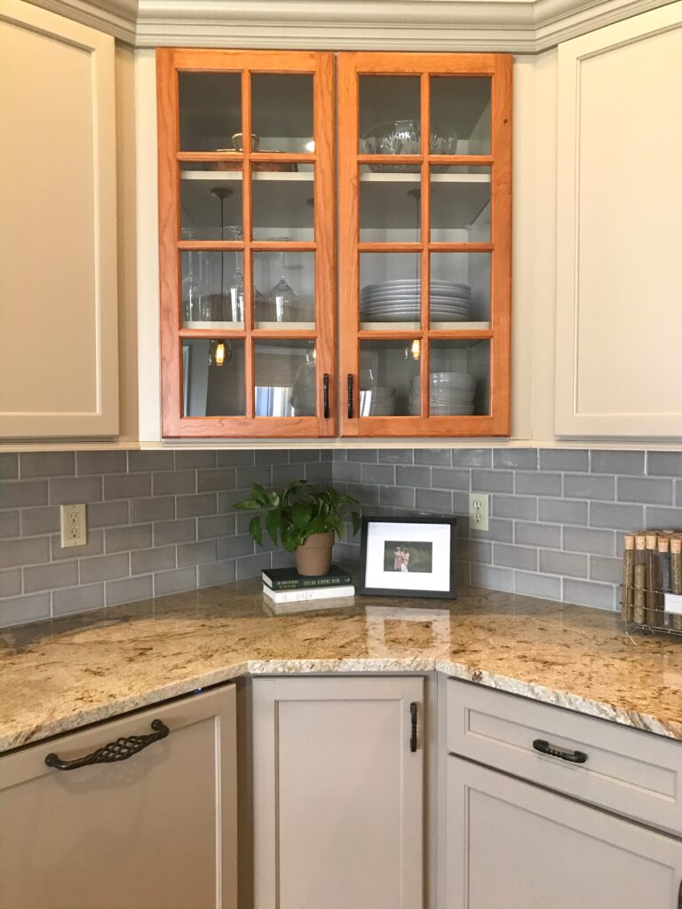
I wanted a multi-tone painted kitchen. And, since I liked the wood cabinets, I decided to keep some of them in their current state to add warmth and texture to the space.
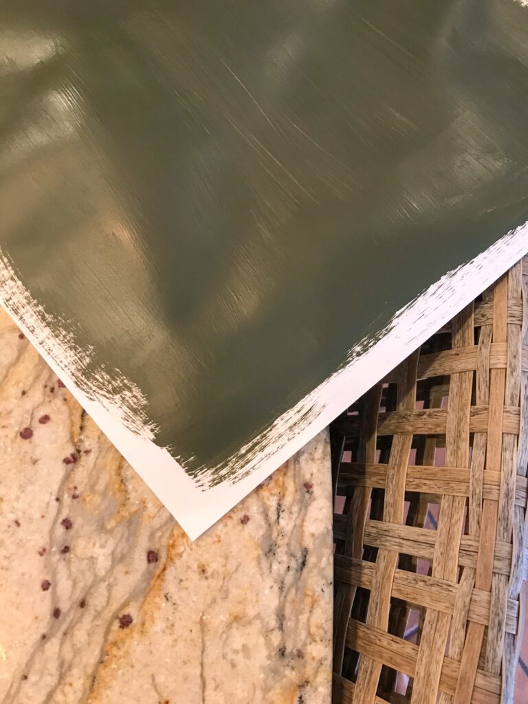
Picking paint colors was, as it always is for me, hard. I stared at a ton of swatches until my eyes crossed. Eventually, I removed the face of the trash cabinet and painted the inside my top colors. I’m so happy I did this as I decided the green I wanted for the island was too light.
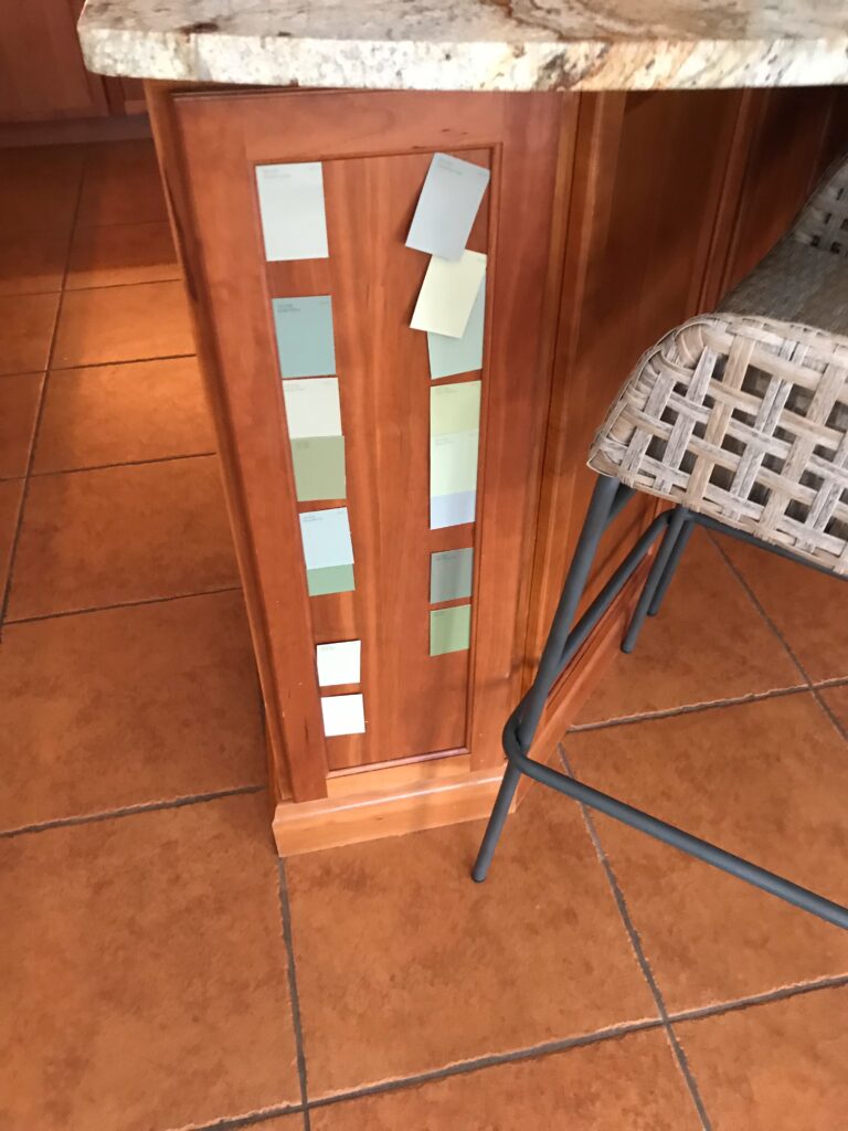
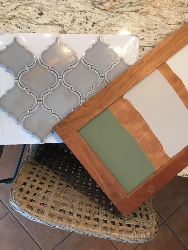
Finally, I had the idea to get a poster board and paint half of it with the color I wanted for the outer perimeter and the other half the new green I picked for the island. It made it simple to move the large painted pieces around the kitchen to see them in different lights. I ultimately decided on Sherwin Williams’ Balanced Beige for the outer cabinets and Benjamin Moore’s Forest Floor for the island.
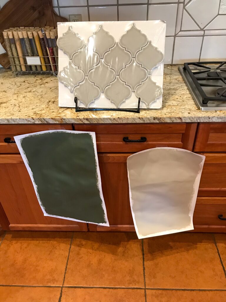
The backsplash was a lot easier for me. Going with what I know, I opted to put in the same backsplash I used in our previous home from Home Depot. I kept it classic with a subway tile layout and a herringbone design under the hood.
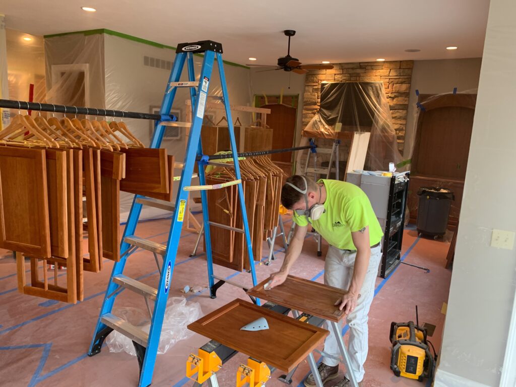
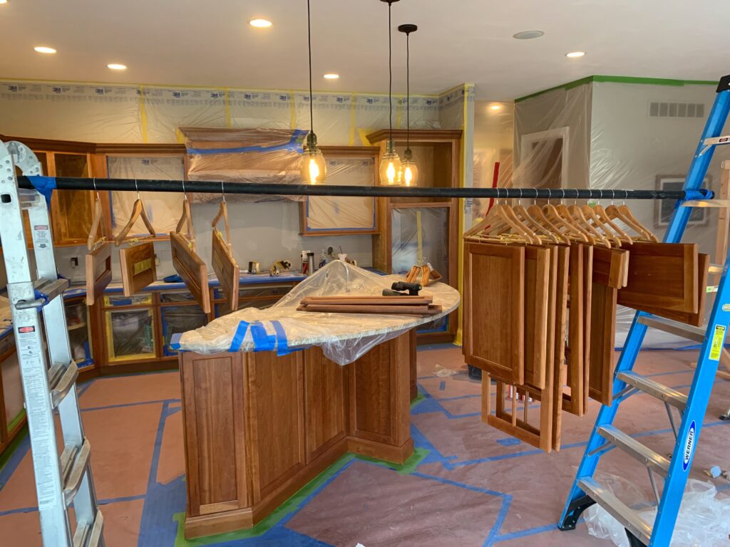
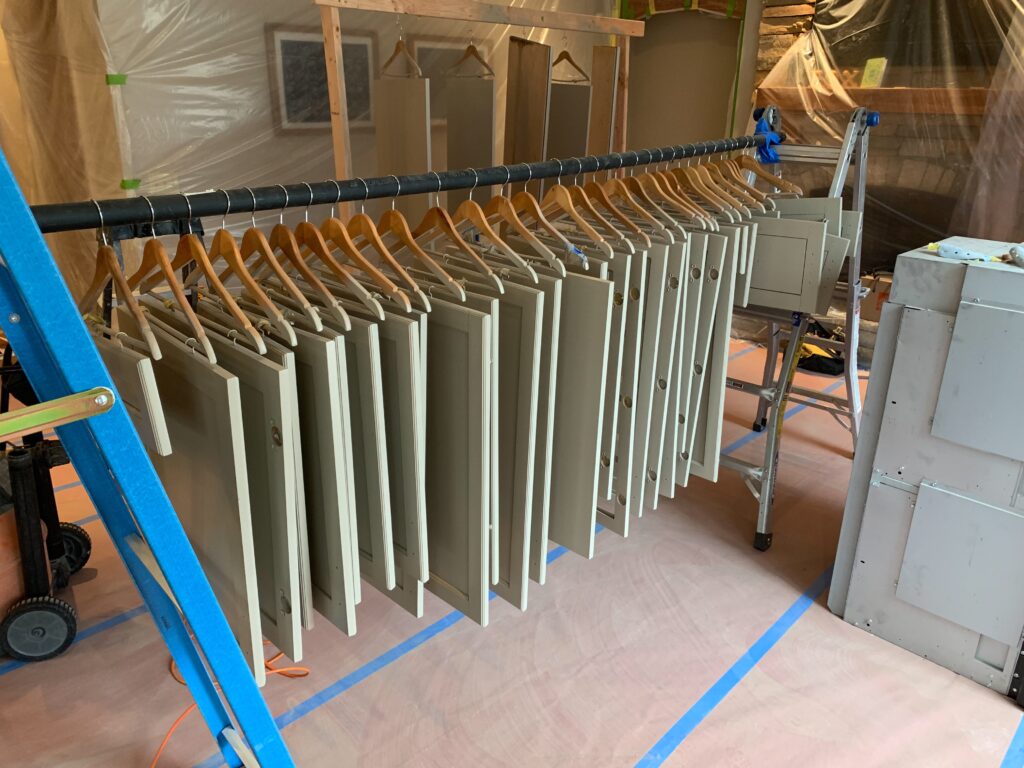
For me, the hard part was done. Our handyman is a painter by trade and sprayed the cabinets while we were away on vacation. It was so fun to come back to a new kitchen!
The Result
I love the way the kitchen facelift turned out! I’m also ecstatic that I was able to update it for a fraction of the cost that a full on renovation would be.
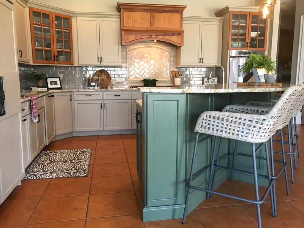
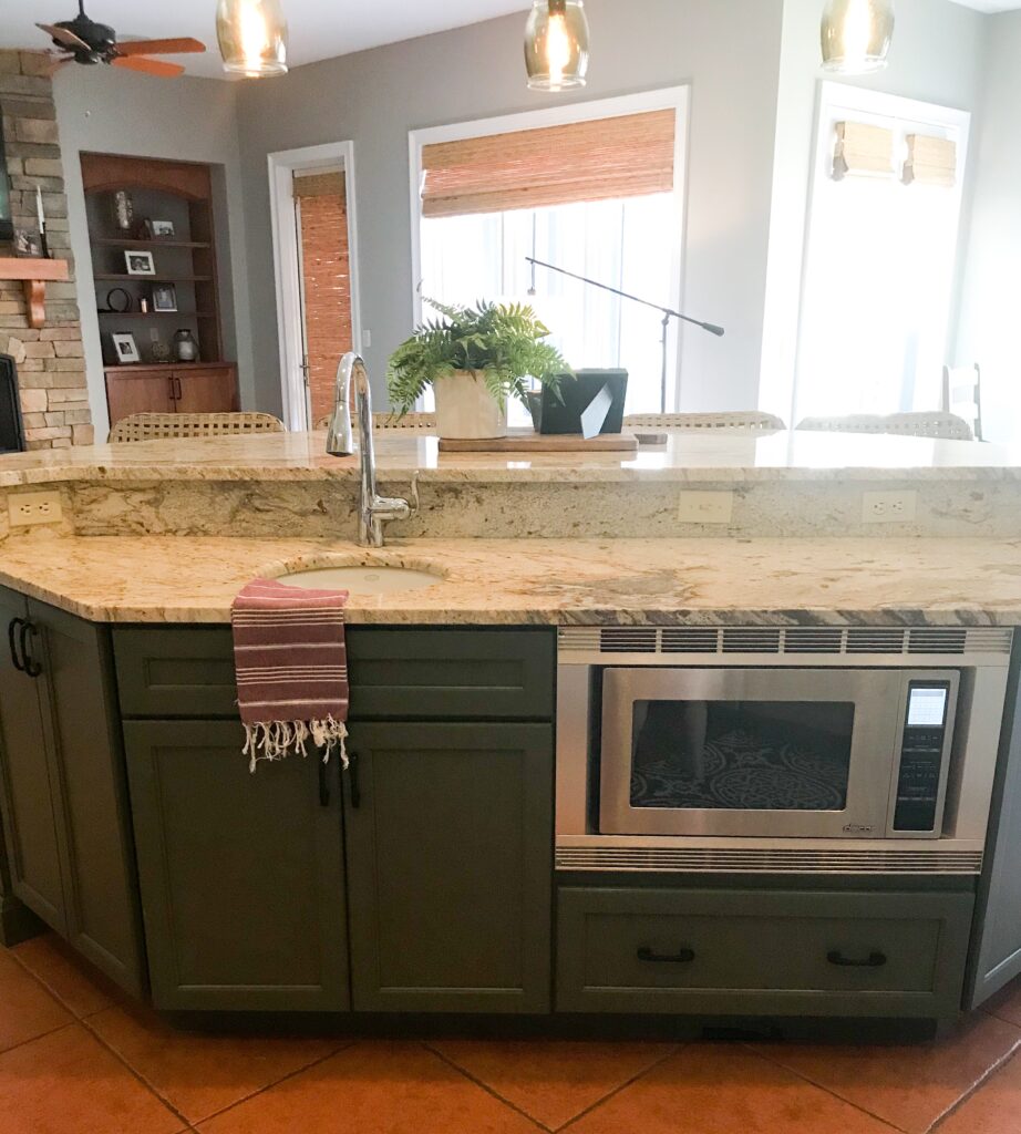
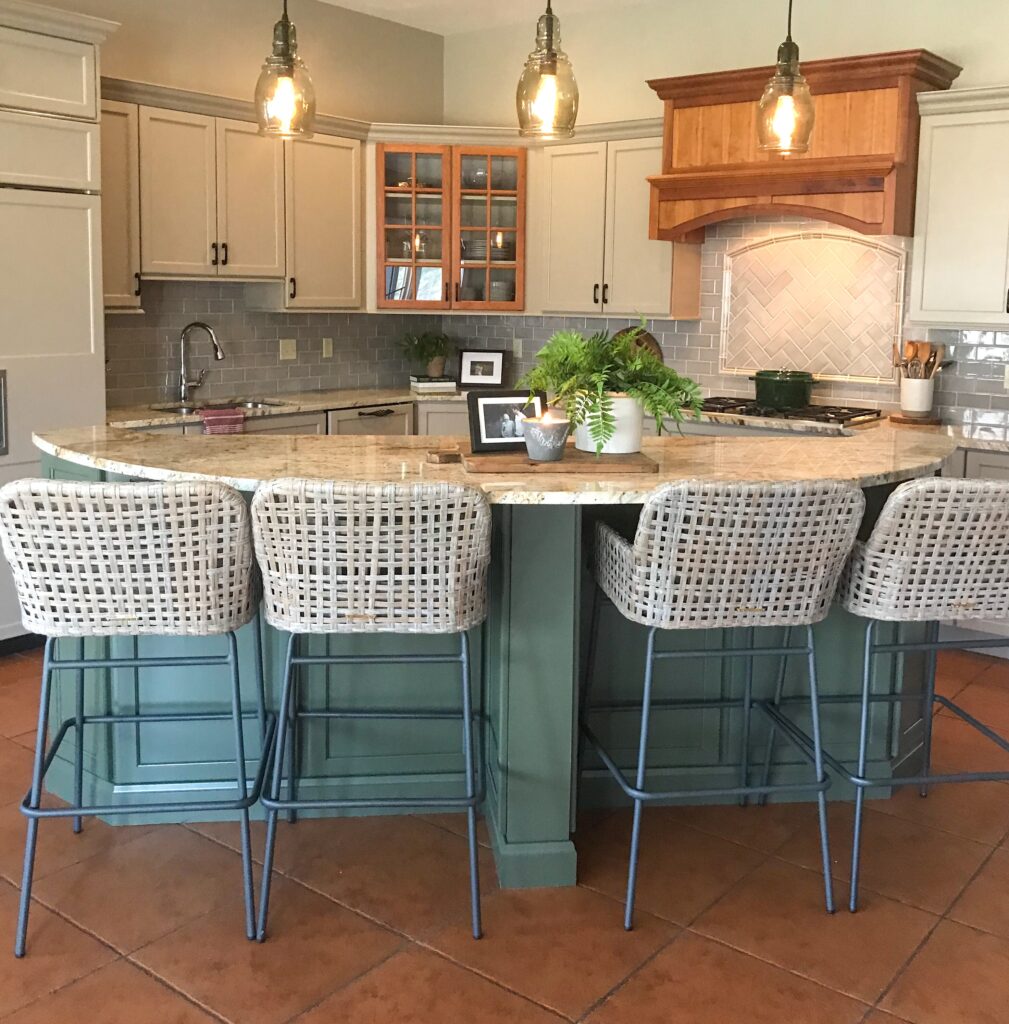
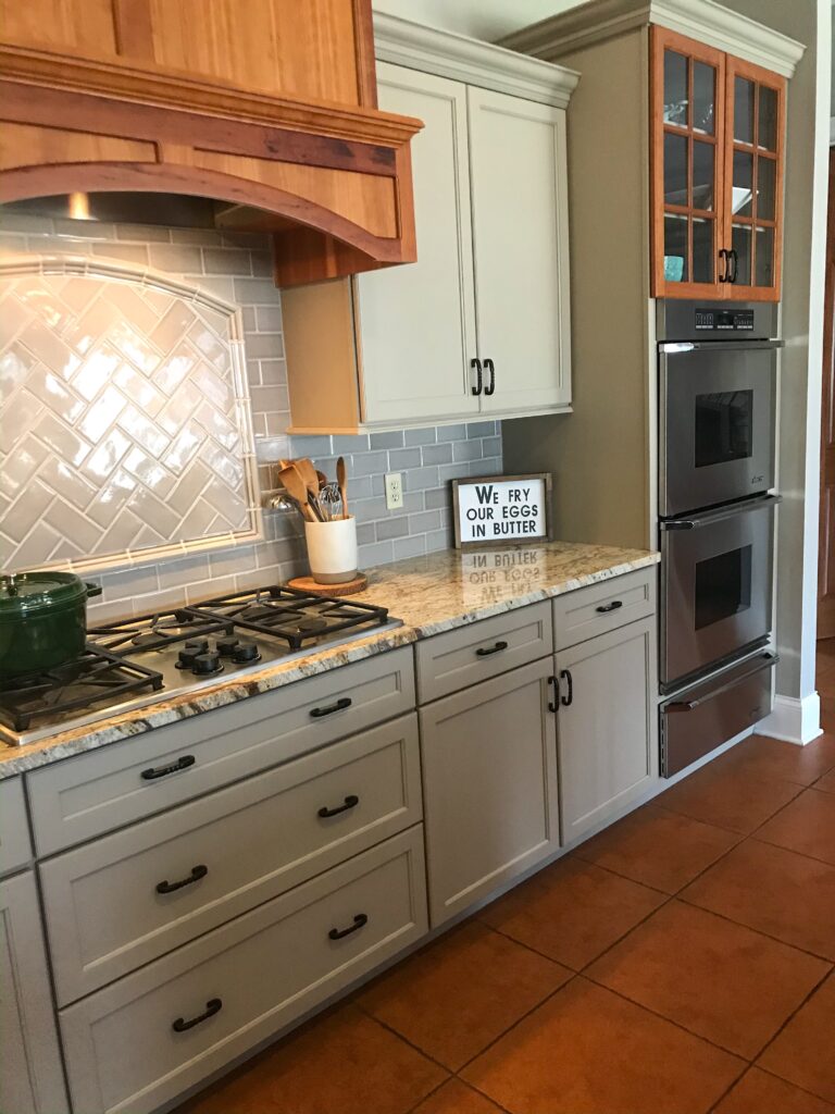
I had put in recycled glass pendant lights from Pottery Barn right when we moved in and luckily they fit perfectly with the beige/greige/green and wood color scheme. The wicker bar height stools from Ballard Designs also worked well.
Let me know your thoughts in the comments.
-Brittany
